Minneapolis office renovation balances history, design and functionality

Minneapolis office renovation balances history, design and functionality
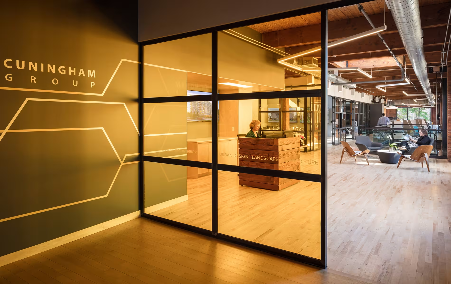
In 2017, Cuningham Group renovated the largest of its seven U.S.-based offices in Minneapolis, Minnesota. Located in the historic St. Anthony Main office complex along the Mississippi River, the office blends 21st Century office design, sustainability and state-of-the-art technology in a late-1800s building.
The overarching goal for the remodel was to create an aesthetically-inspiring space for Cuningham Group employees, clients, and guests, that was also functional. The design came out of the firm’s need to address plans for future growth and expansion. It also responds to density and space equity issues by addressing the changing work styles of our employees. Specific attention was given to how space was allocated (shared resources/amenities, individual workspace, collaborative and amenity space).

The new environment is also client-focused, as it allows outsiders to get acquainted with us in ways that matter to them, whether it’s at the entry or back of house, and how we bring clients and partners through the design process.
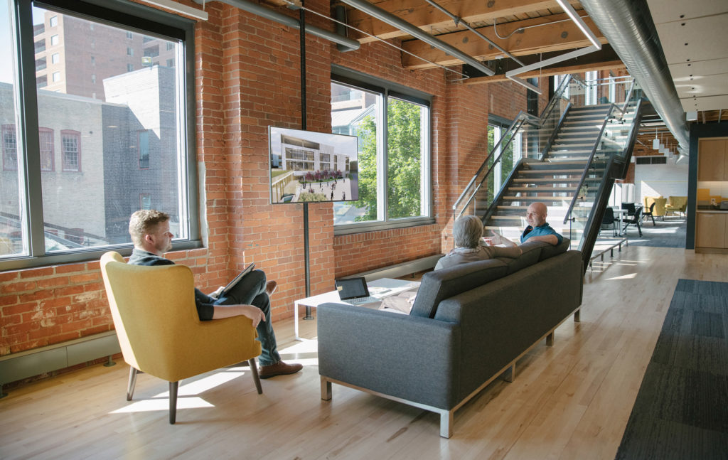
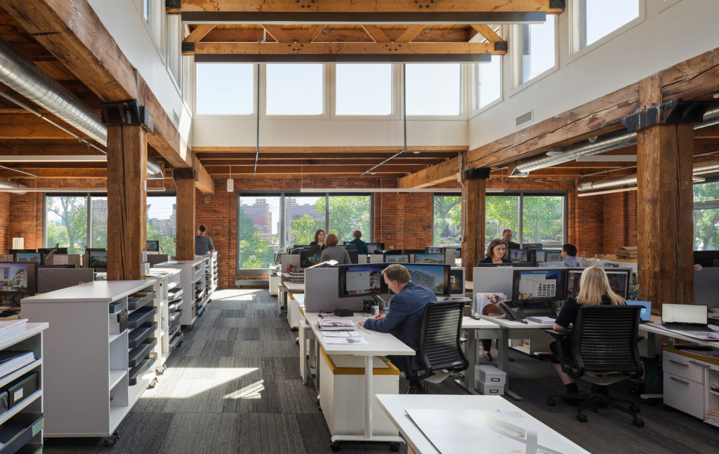
The design intent was to honor the building’s unique and historic structure by making simple, yet bold design moves that also elevate the firm’s brand. The focus was kept on the existing building structure and leverages the exposed timber and brick, which are a strong part of the office’s palette.

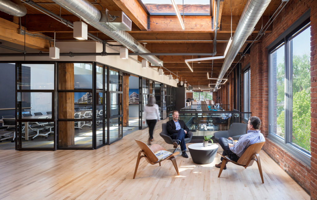
To open up the experience to the river and showcase the vast views of the Minneapolis downtown skyline, the design team moved the “spine” of the space from the center to the side along the expanse of windows. The design focuses on an open feature staircase, which is wide enough for quick conversations. Open table space and flexible seating arrangements along the windows also allow for meetings, quiet workspaces and gathering spots.
Cuningham Group followed the WELL Building Standard™ (WELL), which closely aligns with the firm’s long-standing core values. WELL is the first building standard to focus exclusively on the health and wellness of the people in buildings. WELL design features include ergonomic work stations, acoustic comfort, thermal comfort, integrative design (team coordination), altruism (charitable activities), and adaptable spaces (flexible design and multifunction areas).

Other design features include:
Flexible and shared workspaces: The new office features several multi-functional, shared work and gathering places, including high-use kitchen spaces, informal sitting areas, and flexible furniture.
Strong attention to daylighting: In addition to wide expanses of windows in work and gathering spots, conference rooms feature clearstory windows and skylights.
Finish materials and furnishings: A simple palette of wood, felt and patterned carpet were intended to complement and soften the existing building materials without overwhelming them.
Lab space: A Collaboration Lab and Materials Library is situated in a central location on the second floor.
Experimental Elements: Many of the design selections are meant to be an experimentation on ourselves, including lighting, technology and furniture. As we move forward, we will continue to learn and evolve, staying on the forefront of design, and testing products that we may use for client projects.